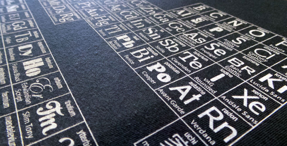
Typesetting is, according to the Britannica Encyclopedia, “the setting of type (characters) for use in any of a variety of printing processes” (even if the files don’t get printed, which is very common nowadays).
To help you visualise it, think of a glossy magazine or catalogue you have picked up recently. After it was written, edited, perhaps translated and proofread; and before it was printed, a typesetter would have made the text look nice and appealing to the eye.
Typesetting services, also known as desktop publishing or dtp services, are commonly offered alongside translation services, as the end use of a translation (especially if it’s a marketing translation or transcreation) is often for publishing purposes.
Today we have the honour of interviewing a great typesetter and friend, Michael Langley; he will give us a bit more insight into the art of typesetting.
Michael, when and how did you discover your passion for typesetting?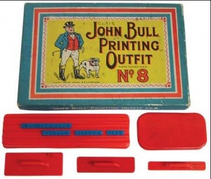
When I was a child I was given a John Bull printing set as a birthday present and spent that summer with a pair of tweezers and 8 point rubber characters composing paragraphs and stamping as many things as I could until one by one I lost all the tiny rubber letters. I trained as a printer in my first job and then as a phototypesetter (before the days of Apple Macs and Postscript fonts). I loved the amount of work involved in the printing process and discovered there was even more work that went into typesetting the pages that I was printing.
What do you enjoy the most when you typeset and what do you find the hardest to achieve?
The hardest part for me is the fine-tuning. Adjusting line space to keep a paragraph in the same column or the kerning between characters to get a hyphen on the same line whilst still achieving a visual balance to the page.
The best thing is composing the overall page to convey the emotion or sentiment of the message without the text itself being ‘noticed’. Like any great movie, the characters tell the story but it’s the landscape that sets the scene.
List the top 3 skills you think a typesetter must have.
 Firstly, an understanding of the rules of typography is paramount. Secondly, a good eye for design and layout, and thirdly, the attention to detail. A good typesetter can recognise bad typesetting, but a great typesetter can use all 3 skills to break the rules and still produce a beautiful piece.
Why do you think translation and typesetting should go hand in hand?
There’s always been a marriage between translation and typesetting. It’s all about communicating to the right audience. From monks and scribes translating and printing beautifully illuminated manuscripts to the different choices of fonts in traffic signage around the world today. Cultures and taste evolve over time and type can reflect this. For instance, the Blackletter typefaces used extensively in German advertising before 1945 today have completely different connotations.
How do you see the future of typesetting?
I see the future both in new technology and traditional typesetting and printing moveable type. Today’s online world demands for the same, if not more, control over the way content is read – whether it is a web page or kindle screen that looks just like a printed page. There are many tools that allow and encourage good practice for typesetting for the web. Font creation isn’t slowing down either, look at the extensive Google font families or the 200 year old font foundries and type designers recreating old masterpieces and creating new classics.
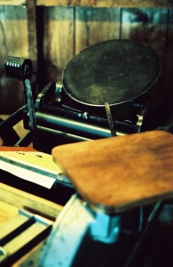
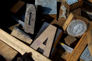
There’s also an increasing interest in traditional letterpress printing, especially in the US. Workshops and evening classes are becoming increasingly popular and you don’t have to look far to find old Linotype printing presses rusting away in backrooms and garages waiting to be renovated and put to good use. Not to mention, the thousands of cases of old metal and wooden type currently being sold on eBay!
 Michael, thank you so much for your time and your answers.
A result of Michael’s love for typesetting and design is his own brand, uchi (http://uchi.co.uk/blog), offering men’s and women’s tee shirts, sweatshirts, hoodies and limited edition prints. All designs are created by himself and each one of them tells a different story.
Did you enjoy this post or have any comments or questions for Michael? If so, please leave a comment below or e-mail us at eva@genuinetranslations.co.uk.
Stay tuned for more articles on the translation world!
